Increasing key metrics by 27% by refactoring the onboarding flow of a SaaS application
Good to know
Pitch is an online presentation-building SaaS application. Its main competitors are Google Slides and Microsoft PowerPoint. The target audience are small businesses using slide decks to win new work (e.g. creative agencies).
Abstract
After the growth team was assembled at Pitch, our first step was to analyze the existing onboarding flow. After reviewing the design and code, we decided to completely refactor it.
Our main objectives were to clean up the code and UI, fix analytics bugs, and overall, put us firmly in control of this part of the app.
We didn't introduce radical UX changes on purpose: before pushing the new version to production, we extensively tested it and had to make sure that it performs at least as well as the original flow.
This goal was ultimately reached, thus unlocking a path for further experimentation.

I began the redesign process by conducting an extensive analysis of the existing onboarding flow
To familiarize myself with every detail of the flow, I manually went through all the possible entry points of the app, made screenshots, and built a flow in Figma.
This document then became the source of truth for further analysis and cooperation between myself, the PM, the research team and the VP of growth.
I included all the bugs I encountered, opportunities for improvement, as well as basic analytics review. For instance, I wanted to understand what the first steps were the new users made after finishing the onboarding process.
The original onboarding UI was basically a long form spread out on ten individual screens. The signup screen was very busy visually (distracting from the signup buttons), while the other views were just pure text and form elements.
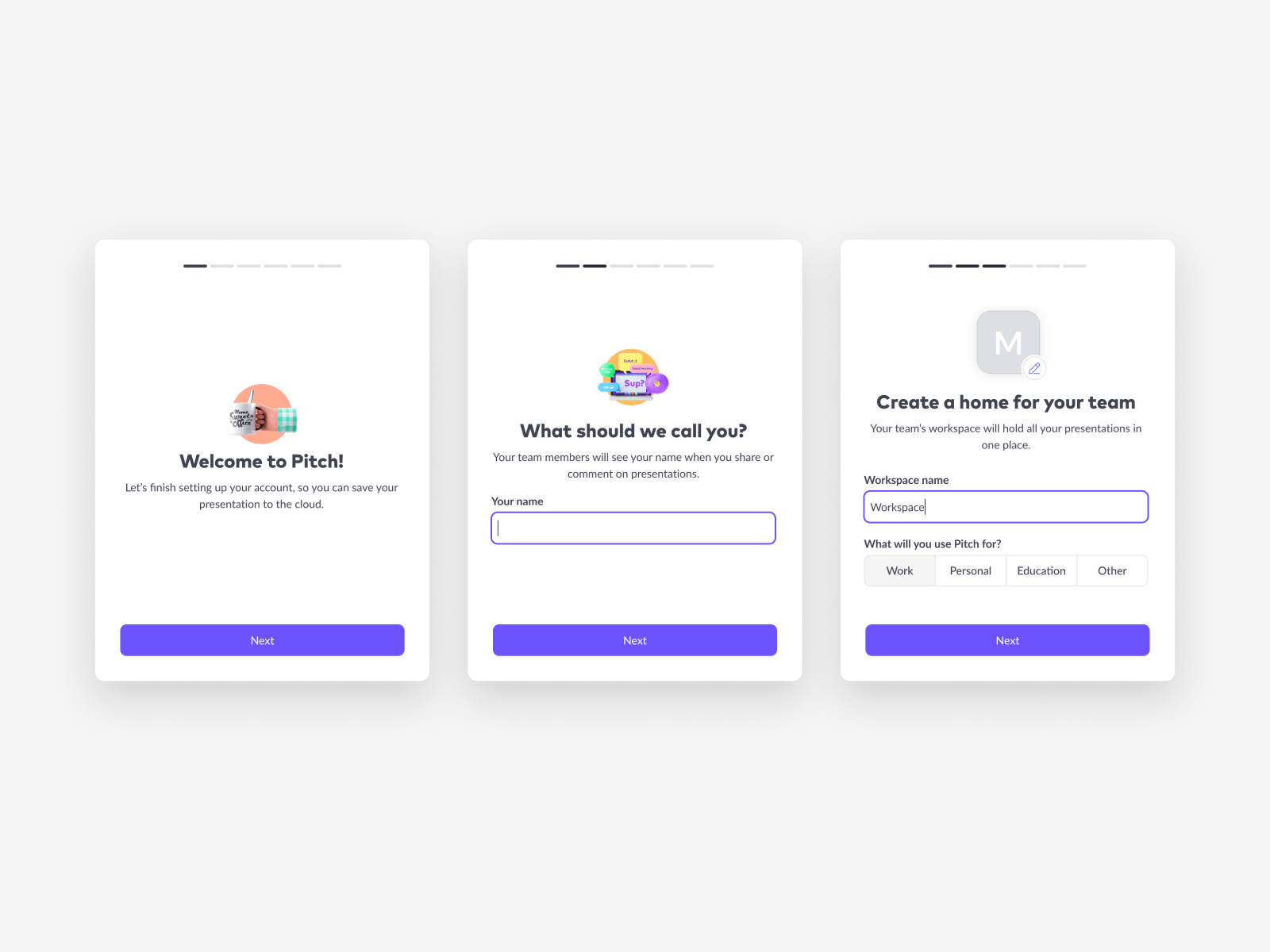
I decided to take the opposite approach: I wanted to clean up the UI as much as possible while introducing visually interesting elements throughout the flow. The user shouldn't feel as if they're filling out a job application.
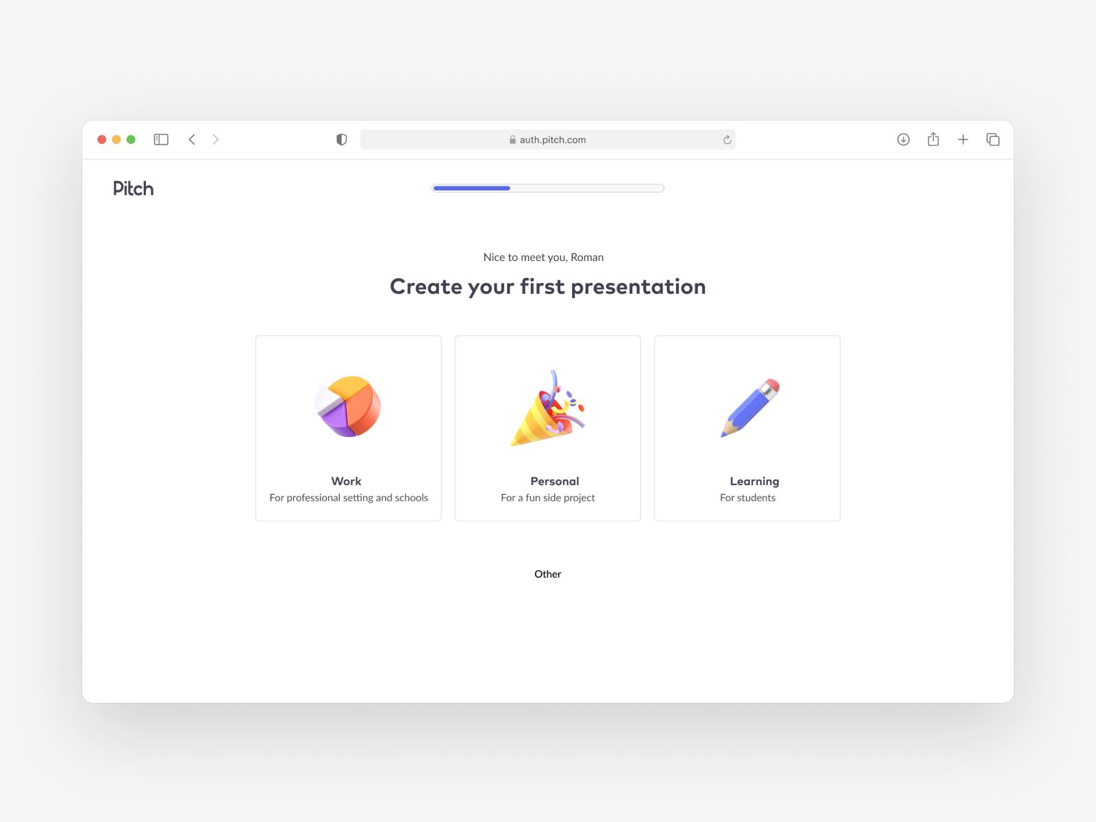
The first rough sketches in Figma helped me to organize my thoughts and lay out basic UI patterns I wanted to use
I introduced a progress bar on top of the screen. It's one of the basic UX principles: progress indicators help users finish longer tasks on the screen.
I also set out to rewrite the copy. I wanted the flow to be personalized to the user: from their name to the use case (job) with which they're coming to Pitch.
Thirdly, I started incorporating illustrations and icons into the UI to make the whole experience more engaging and less tedious.
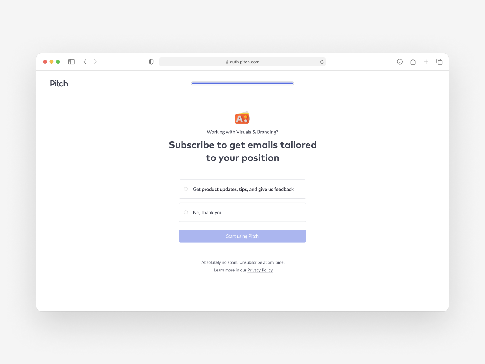
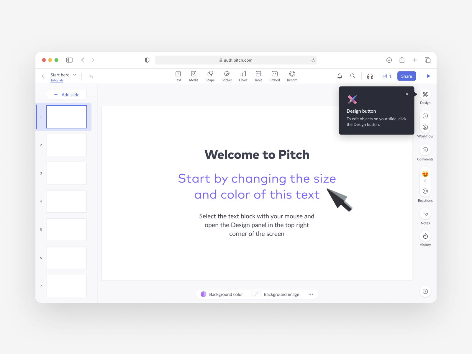
Presentations are used to share information. Why not let our users learn about Pitch through a slide deck?
One of my initial ideas was to create an interactive presentation that would introduce the app to the new users. We hypothesized that showing people the presentation editor (the core product experience) immediately after onboarding would help with retention.
Later, we would experiment with this idea and found out that it didn't work as expected. The users would get the impression that the presentation editor is Pitch - they wouldn't discover other important features (user management, brand import, asset storage, etc.). Thus, the retention metrics actually decreased.
I briefly explored the idea of using a single-page long form, rather than multiple pages in sequence. We abandoned the idea because, at this stage, drastic changes to the layout would make the comparison with the original flow more difficult.
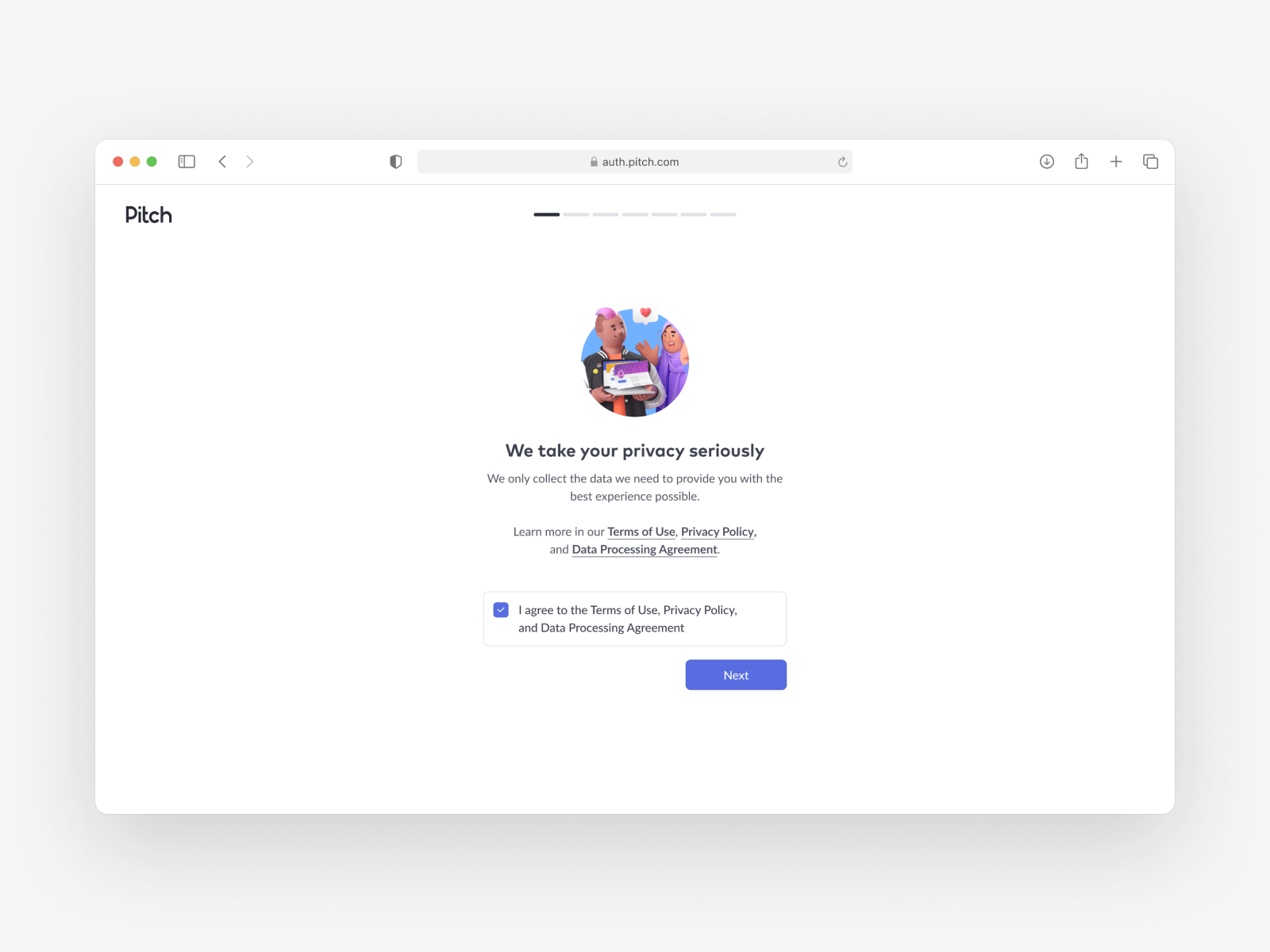
The final version stayed true to the original UX patterns but the code, as well as the UI, became cleaner and more flexible
With the redesigned onboarding flow in place, we were able to start experimenting and properly measuring the key metrics.

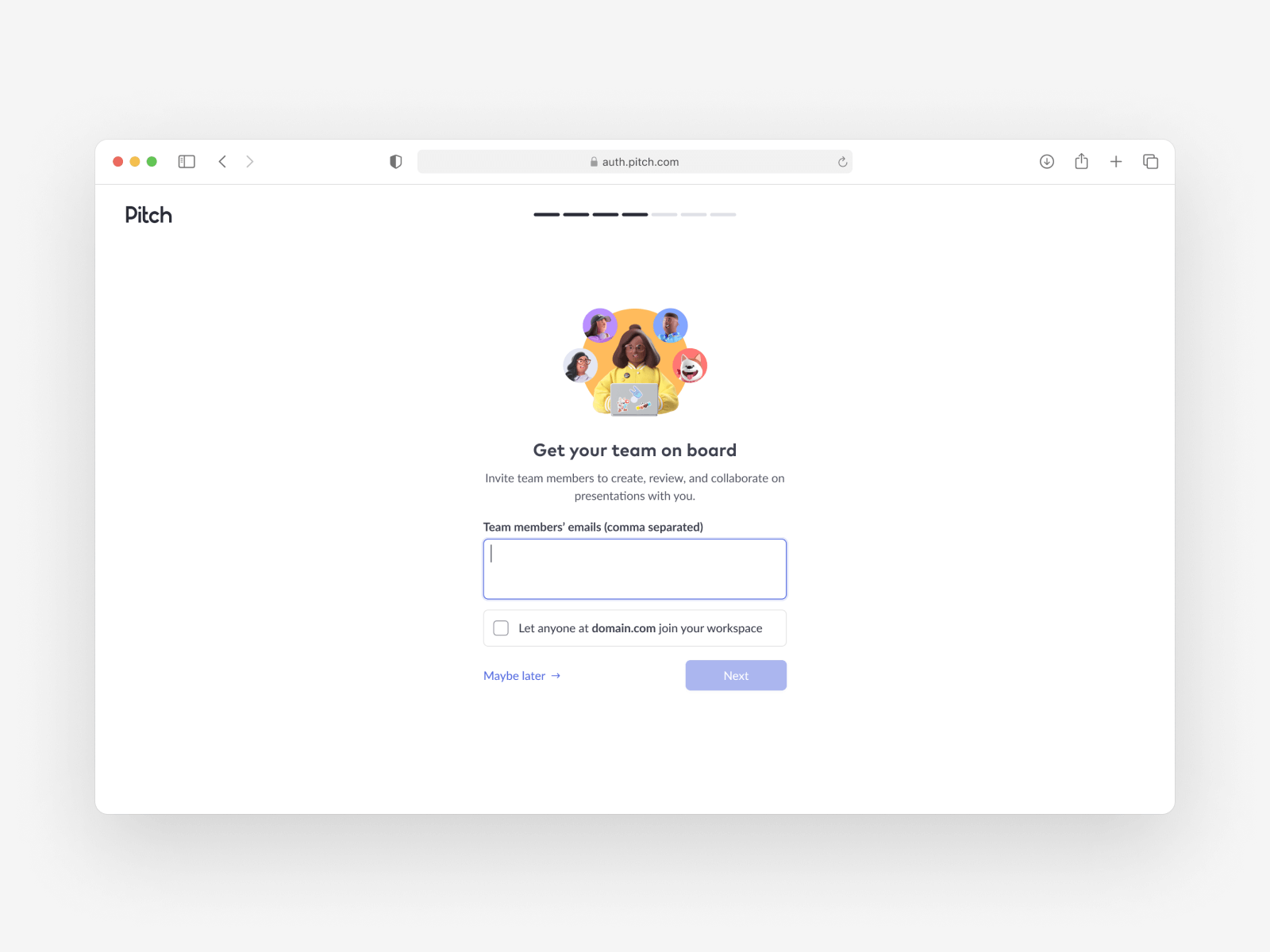
The team invitation screen was one of the most important ones in the whole flow. It prompts the user to invite their coworkers to Pitch. Another key element is the checkbox (Let anyone at domain.com join your workspace) that makes the workspace discoverable to other people with the same email address.
Just by streamlining the user experience, we managed to increase the number of newly created workspaces with discoverability enabled by ~27%.

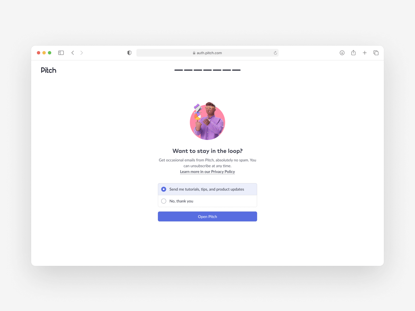
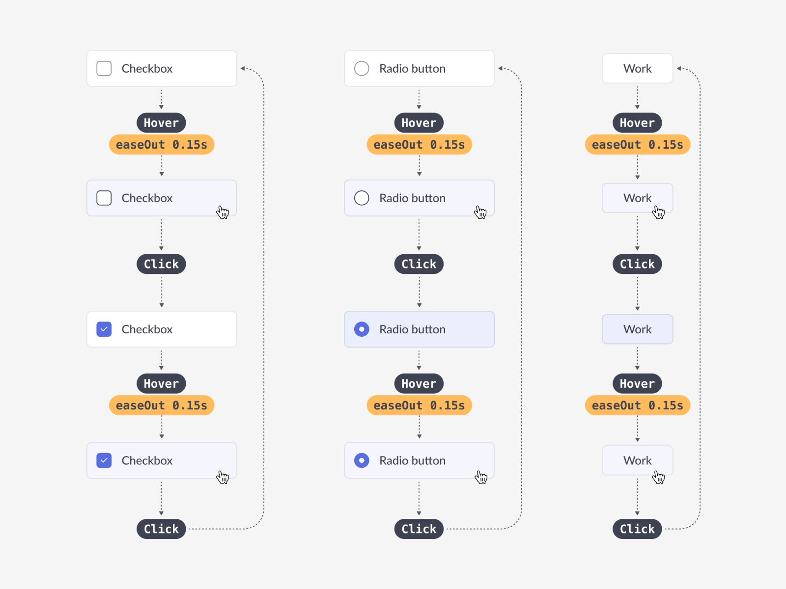
The design specs were meticulously documented, including all the component states and their interactions. This ensured a smooth developer handoff and less time spent fixing front-end code bugs.

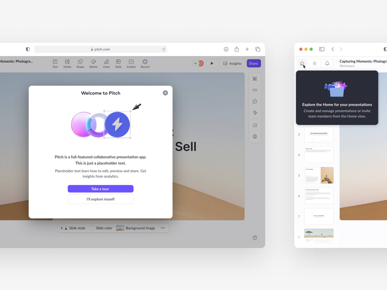
The most recent iteration (as of January 2024) of the onboarding flow uses modal windows, rather than full-screen views
We created this version of the flow specifically for the new AI-powered feature set developed by Pitch. After entering a prompt on the landing page, a slide deck would be auto-generated and the user would be taken straight to the presentation editor.
The modal window form factor has the (theoretical) advantage of showing the user the UI they unlock by completing the flow.
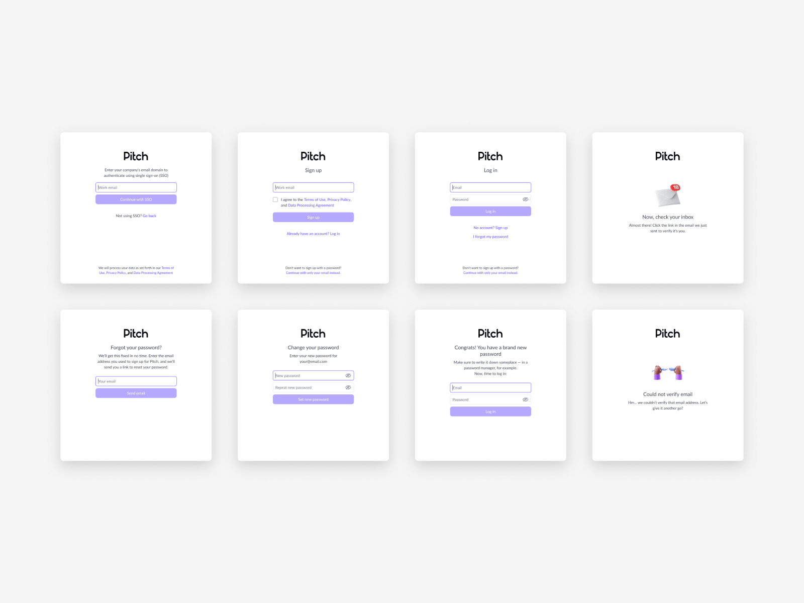
The metrics and quantitative results for this onboarding flow iteration are unfortunately not available. In January 2024, Pitch was restructured and 75% of the workforce (including the Growth team) were laid off.