Validating a hypothesis and increasing key product metrics by 200-560%
Good to know
Pitch is an online presentation-building SaaS application. Its main competitors are Google Slides and Microsoft PowerPoint. The target audience are small businesses using slide decks to win new work (e.g. creative agencies).
Abstract
After hundreds of hours spent interviewing our (potential and current) customers, we believed we discovered a way to unlock user adoption at Pitch: let's make it super simple for our users to import, manage, and apply their company branding to presentations.
To test this hypothesis, we created an MVP version of a "template builder" UI, which allowed the users to easily create a presentation template with their brand colors and fonts embedded.
In the end, this proved to be the way to go forward as even with a very rudimentary feature, we managed to more than double our key metrics (e.g. template creation and usage).
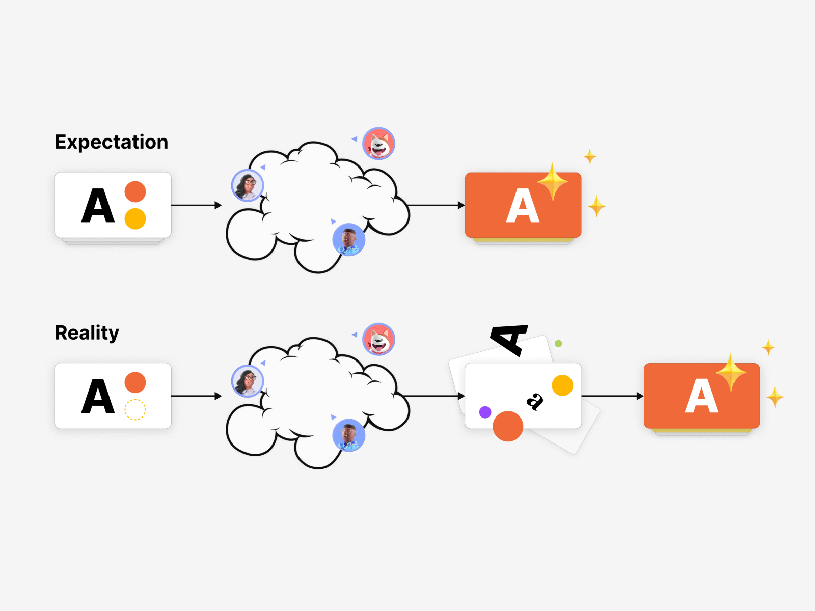
User interviews showed that our existing styling features were not as good as we thought.
Especially in a collaborative environment, it was very difficult for our users to keep the styling consistent in their presentations.
Pitch design philosophy has always been about simplicity.
Because I'm a millennial, I'm illustrating my thinking behind this product feature as a meme: the user is always in control but Pitch holds their hand where needed, provides guardrails, and quietly makes sure that the end result (the presentation) always looks good.
It's kind of similar to the IKEA effect.
The game Townscaper is another good way to put it. As the player, you're building beautiful and elaborate towns just by clicking your mouse (or tapping on the screen). You're in control but the game does the heavy lifting for you and makes sure that no matter what you do, it always looks nice.
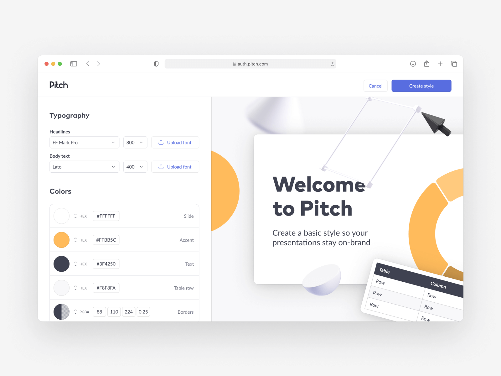
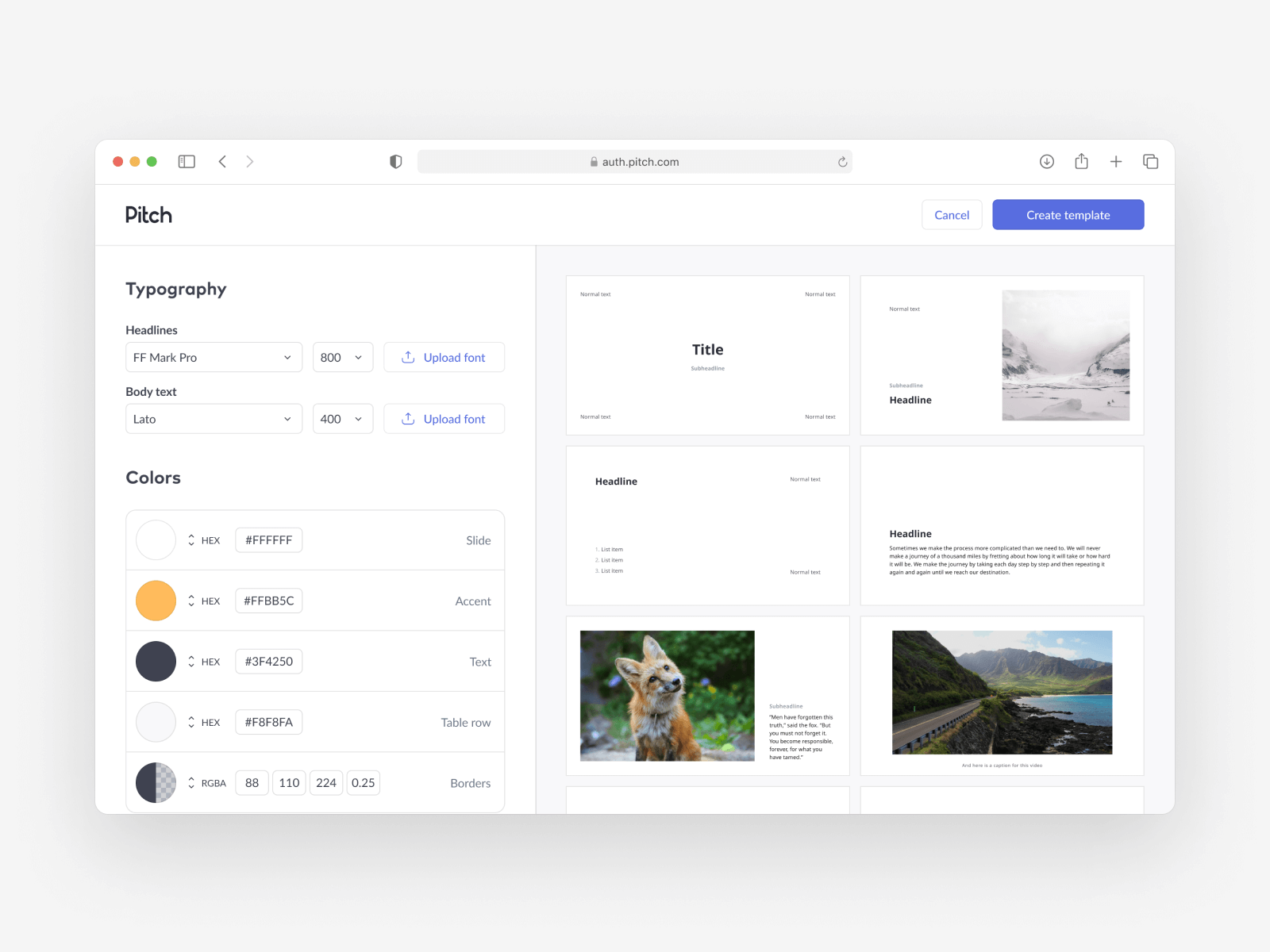
I started by making a couple of rough sketches in Figma.
I wanted the UI to be super simple and visual. On the left-hand side, there are font and color selection elements. On the right is a stylized presentation slide with the corresponding style settings applied.
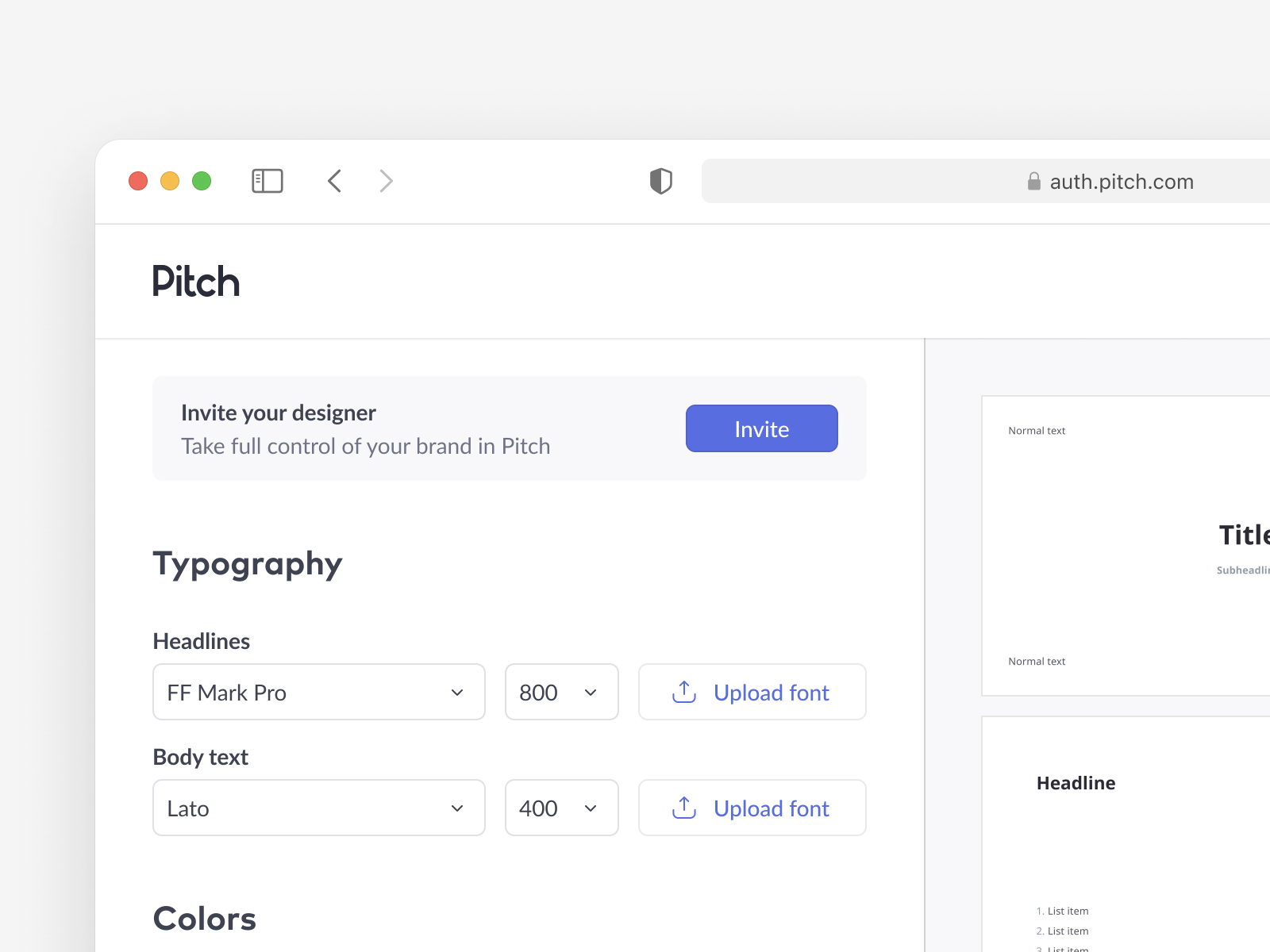
We were always looking for ways to increase the number of people in the given team (workspace). I had an idea to include an "invite your designer" prompt for the non-designer first-time users (such as manageres or sales people).
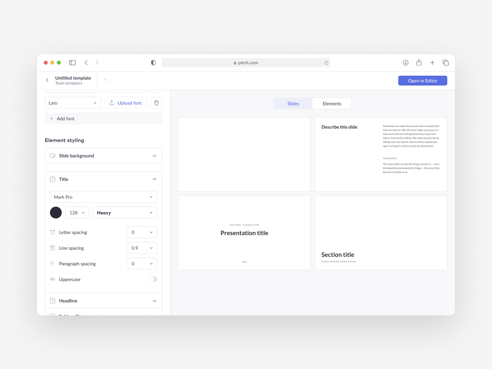
As I progressed through my design exploration, I experimented with more elaborate and powerful styling features.
In the end, I decided to keep things simple. However, the abstract representation of a slide gave way to multiple actual slide thumbnails: one of the things we'd heard consistently during the user interviews was the lack of context people felt when styling their presentation in Pitch (the changes were not immediately visible on their slides).
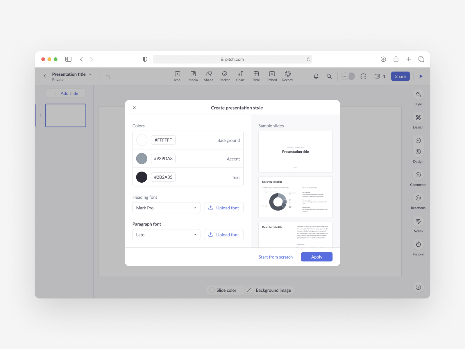
Although personally I feel like modal windows should be used sparsly (a modal window as an UI element has a clear purpose), in the end we decided to place the UI in one. This was due the fact that a modal window was easier and faster for the engineers to implement.
I swapped the left and right-hand sides in the final version. I wanted to keep things consistent across the app - in the presentation editor, the color and typography controls are placed on the right-hand side of the window.
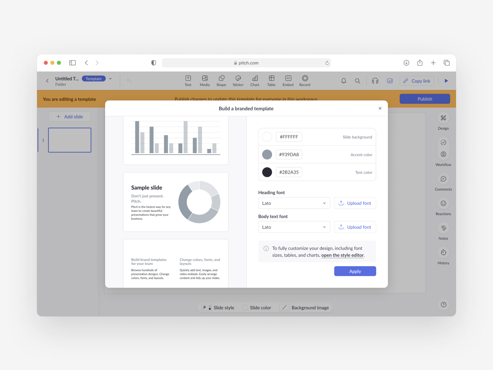
Creating the entry point: if everything is visually prominent, nothing is
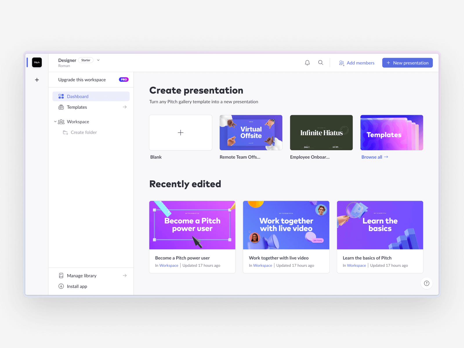
In order to get the users to the new UI, we obviously had to create an entry point. All the new signups end up in their Pitch Dashboard by default. My problem here was that even in its empty state, the dashboard was full of visual distraction.
It's not clear what is the most important element to click on - what should I do first?
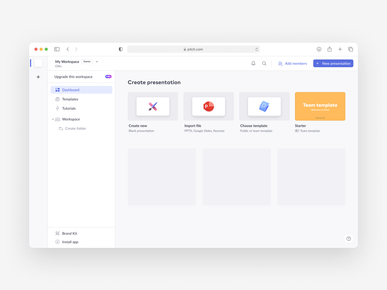
My initial idea was to radically change the dashboard empty state. I wanted it to be more - empty.
Then, as the user went through the onboarding process (before they see the dashboard), we would take the company URL from their email address and scrape the CSS.
Based on that data, we would build their first presentation template in the background. This is what the yellow thumbnail in the top right corner represents.
Unfortunately, due to dashboard updates being out of scope for this project, we had explore alternative solutions.
After finalizing all the necessary designs, we were able to user-test a Figma prototype
The interviews went well, and we were able to put the MVP version of the feature to production.
The results were encouraging, to put it mildly
Allowing users to easily apply their brand styling on presentation templates had a huge positive impact on product usage and retention metrics.
- Business templates created increased by 200%
- Workspaces with published (made available to team mates in Pitch) templates increased by 560%
- Overall document creation for business workspaces increased by 16%
- Workspace template usage increased by 260%
Encouraged by the validation of our hypothesis, we set out to build a robust "Brand Kit" feature set for Pitch.