Learning by teaching: how I created two top-rated online design courses
Abstract
I wanted to force myself to organize my notes on design collected over the years. So I wrote everything down, recorded it, and created a series of videos. 15 hours of footage, to be exact. What came out of it are two of the top-rated online design courses in Central Europe (videos are in the Slovak language). I give the experience five stars.
Problem
I wanted to make a design course for my 20-year-old self
Everyone’s memory is different. I learn best by writing things down. So from the start of my career, I did that. UX design concepts, UI tips, you get the idea. The problem was that my notes were all over the place. So a few years ago, I decided to put the chaos in order and create something comprehensive. From there, it was just a few steps to recording and publishing it as two online courses:
- Screen Design (Theory)
- UI Design in Sketch (Practice)
I wanted it to be useful for beginners. But how? There’s an abundance of free information out there. All you need is Google. I think there’s a catch, though.
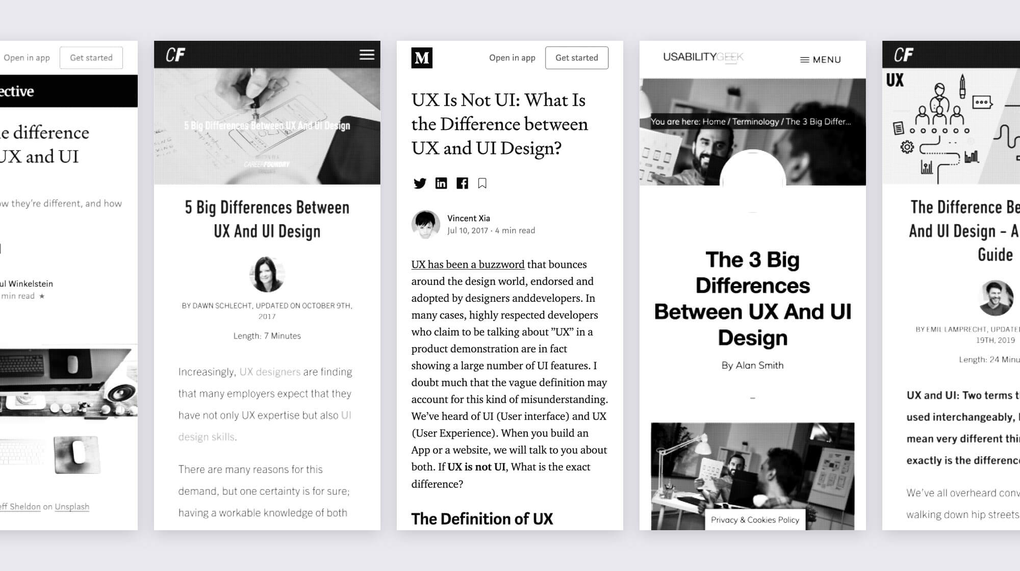
Most of the “designer” reading out there is the same stuff, rinsed and repeated.
It might just be me, but I increasingly find it more difficult to find learning material. Don’t get me wrong, it definitely exists (Design teams on Medium, Intercom Blog, NN/g, …) but to get to the good stuff, you need to plow through a thousand articles on “The difference between UI and UX design.”
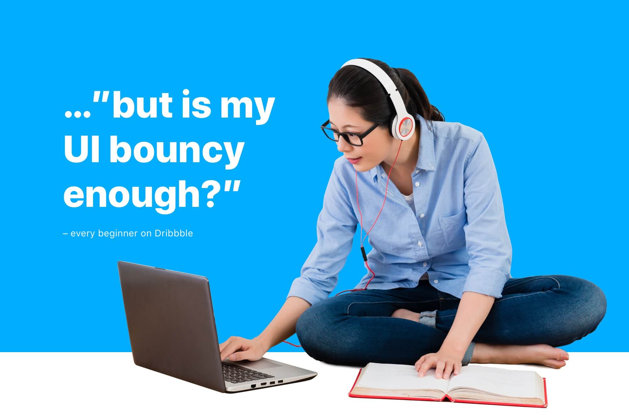
I tried to create something I would’ve liked to watch 10 years ago. Condensed, useful, practical information. I don’t think I’m saving the world by doing design (I enjoy it, though). I do think that anyone can learn it. I don’t believe in absolute statements and oversimplification. There are no 5 best tools and 10 essential tips for building a great UI. Orange is not “the color of creativity.” I don’t think you’ll hire a good designer by having “just send us a link to your Dribbble profile” on your Careers page. Because on Dribbble, a bright yellow CTA with white text gets a thousand likes, as long as it’s animated with a springy enough easing curve.
Solution
When creating the curriculum for my theoretical design course, I was inspired by the 5 Whys technique
I believe that building any kind of skill requires deep foundations. Before you learn about jobs to be done, personas, or Gestalt psychology, you need to know what a pixel is. When I’m explaining how to do something, I want my students to really understand why we’re doing it. When learning front-end development, it’s always useful to know how the JavaScript engine works. That’s why I divided the course into several sections.
Design is not a beauty contest
Design is about finding effective solutions to people’s needs and pains. A transformation of complexity to simplicity. It’s not a solitary, isolated activity, cooperation is necessary. You’ll need to learn how to code.
The building blocks of screen design
Pixels and images: how mixing of color light creates JPEGs. Hexadecimal codes and alpha channel. Points and screen density. Everyday design tools, from Figma to Framer. Google Analytics is a design tool as well. Apple HIG and Material Design.
Basic UI elements
How GUI was created in Xerox PARC and used in the first “Mac” computer. Round corners were invented by Bill Atkinson. Don’t overuse shadows. A typography crash course: from Helvetica to H1. Why “to the right” means “forward” in UI and what Walt Disney can teach us about easing. 0.3s.
UX design basics
Everything begins with a purpose; and a wireframe. J. J. Garrett’s Visual Vocabulary. How a UX writer can generate millions in profit. How products get their features. Jobs to be done, personas. Empty states and error handling. Fitts’ law and touch targets.
UI design basics
Circles are styled rectangles. Google CSS. A website is just a tricked-out text document. 8-point and other grids. Text readability and contrast. Working with user’s attention and how it fits together with empty space and Gestalt psychology. Don’t worry about the golden ratio.
Putting it all together
Reciprocity, scarcity, social proof, choice paralysis and always be closing. Affordance is good, dark patterns are bad. How to properly design and use navigation, forms and modals. Yes, non-modal windows exist too. You don’t need a two-way mirror to user-test your website. Ask “did you” instead of “would you.” Ask why.
In my other course, I explained Sketch, its features, and how to use them in practice
I didn’t want to just flood the students with keyboard shortcuts and say goodbye. Once again, I wanted to go deeper. I explained who a UI designer is: always part of the team, often working in close cooperation with engineers.
Results
Both courses received top ratings from the students
“Thank you very much for the course, it helped me to figure out a lot. Pleasantly delivered in an understandable and down-to-earth manner.”
– Lenka
“Great course. Very pleasant to listen and watch. I don’t need to force myself to it at all – on the contrary, I enjoy it and can’t turn it off. Also, it’s very well structured.”
– Jana
“I learned everything I needed. Thank you ?.”
– Stanislav
“The lecturer gave it his best. Really thorough and sometimes funny :)”
– Michal
“That was awesome! :)”
– Miroslava